Leitíssimo Milk
Scope
Brand Strategy
Positioning
Naming
Brand Design
Packaging Design
Graphic Design/ Communication
Site

About Leitíssimo
New Zealand producers came to western Bahia to create a tropical dairy production model: farms interconnected by their own infrastructure, genetics adapted to the Brazilian climate, and data-driven management. The result was Brazil’s first premium milk brand from a single herd under exclusive conditions.
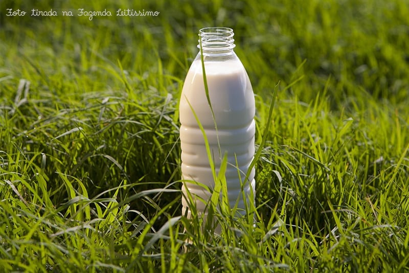
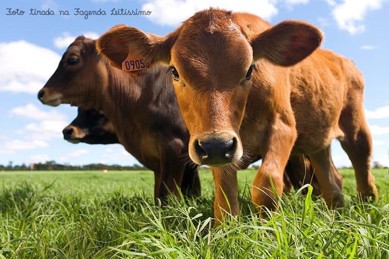
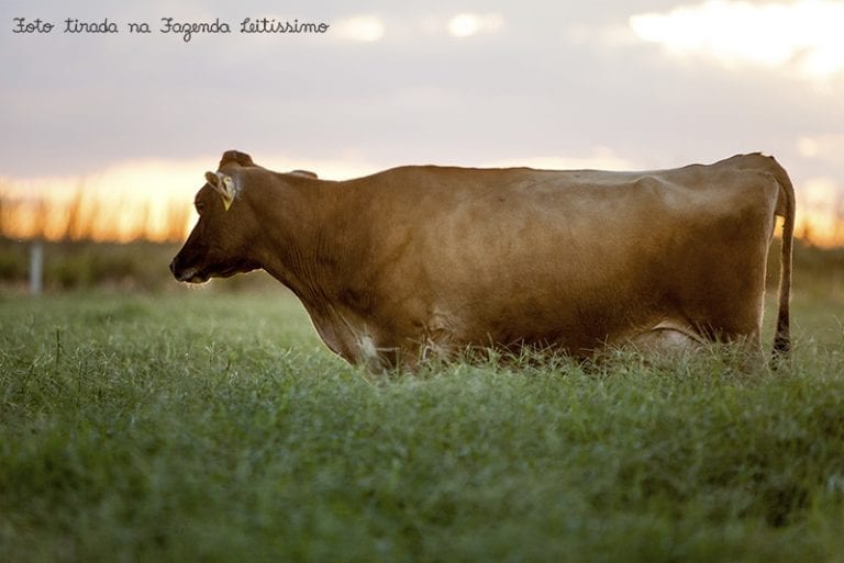
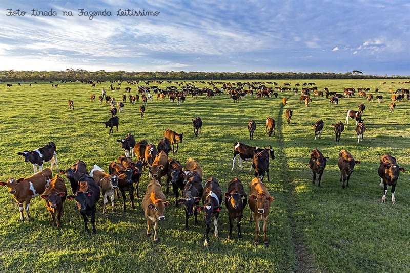
The cows live and graze freely 365 days a year, without confinement, in a controlled environment free from tuberculosis, brucellosis, and rBST—a hormone common in Brazil but banned in many countries. With production of around 70,000 liters daily, the milk is minimally processed to preserve natural flavor and nutrients, evoking memories of pure farm-fresh milk.
Following the same philosophy of minimally processed products without additives, the company expanded first to yogurts and ice creams with Delicari and, later, to natural yogurts with Leitíssimo, embracing the real food concept.
The Branding Challenge
Brand Platform and Positioning.
We established a premium positioning grounded in authenticity: an exceptional product that connects urban consumers to the purity and tradition of rural life, with complete traceability – from healthy cows living and grazing freely in a controlled environment (free of tuberculosis and brucellosis) to bottling at the farm itself in Jaborandi, home to Brazil’s largest pasture-based dairy operation.
Strategic Naming.
We created the name Leitíssimo by transforming “leite” (milk) into a superlative adjective using the “-íssimo” suffix – much like “bellissimo” in Italian – expressing supreme quality. The name reflects the product’s essence: superior, authentic, and the result of harmonious care among nature, animals, and people.
Visual Identity and Trade Dress.
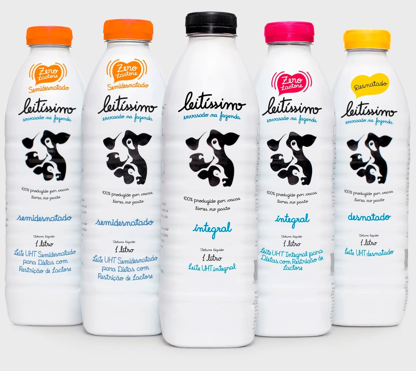
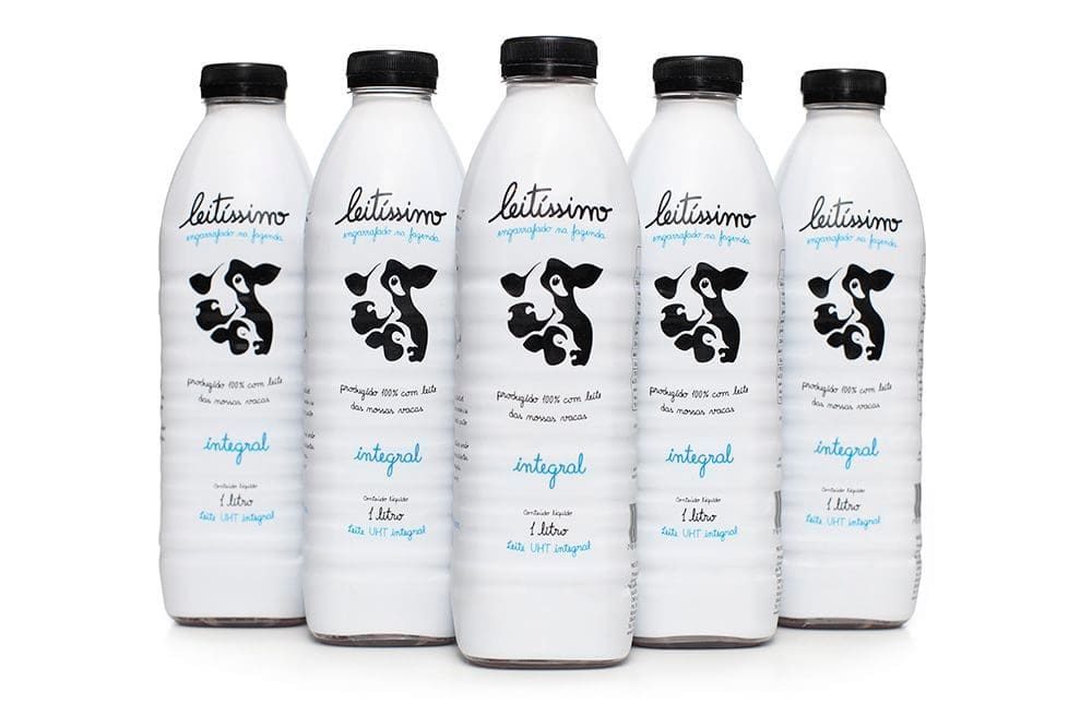
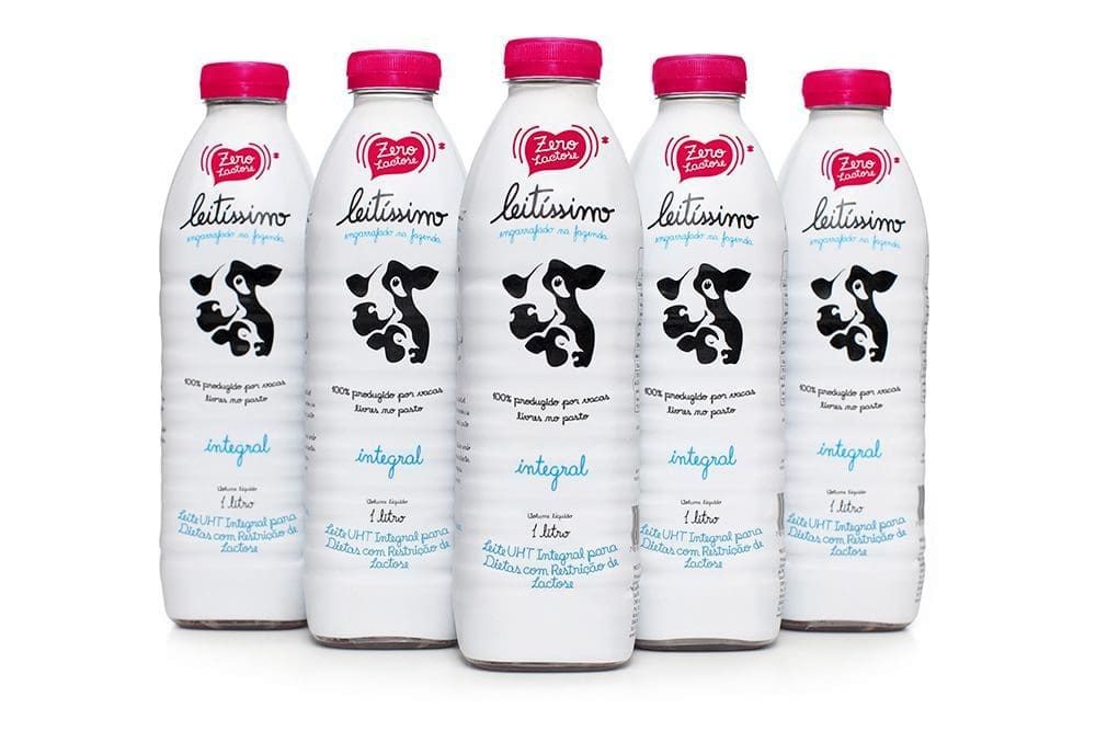
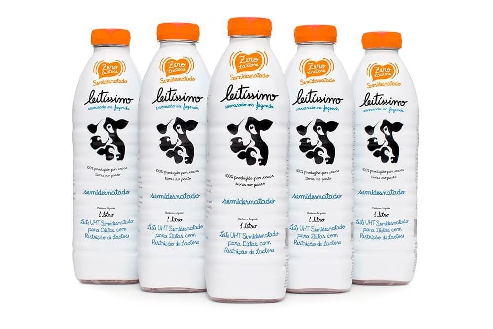
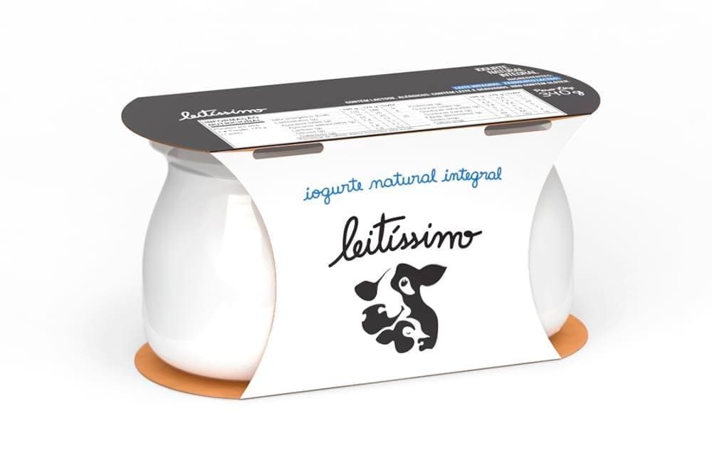
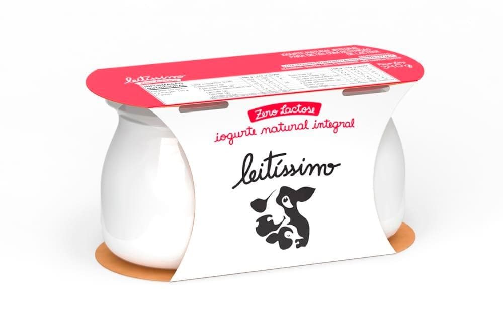
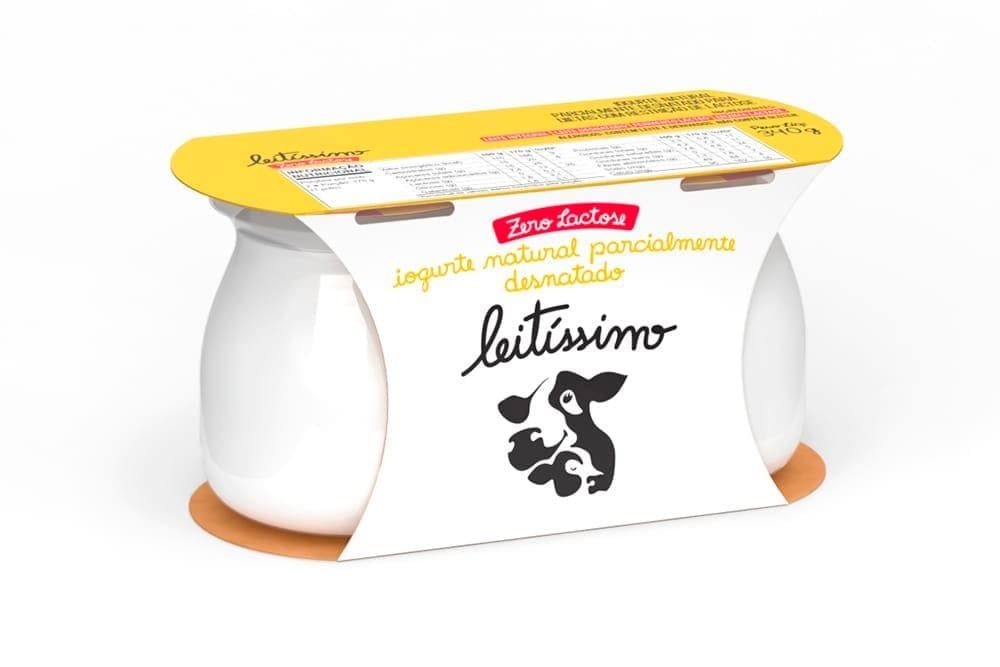
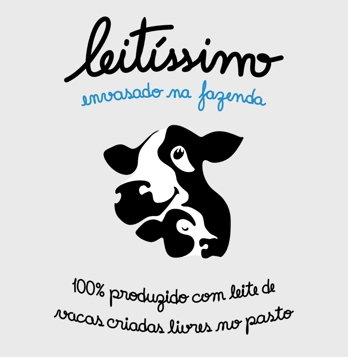
We developed a premium aesthetic distinguished by authenticity and unpretentious charm, standing out through simplicity in a market saturated with visual noise and fleeting trends. The brand, designed to command attention, becomes the central element, supported by a custom typeface, minimalist color palette, and strategic use of white space, creating a protected visual system (trade dress) that is instantly recognizable and proprietary.
Packaging Design as a Strategic Asset.
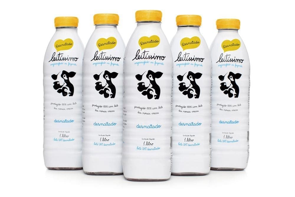
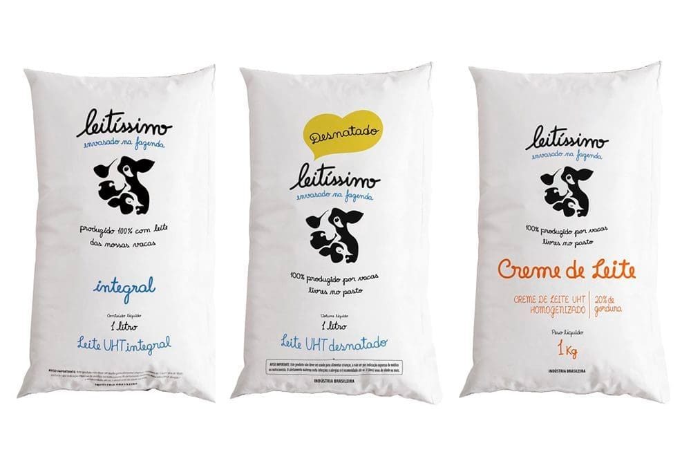
At point of sale, the battle for attention is won or lost in seconds. Our approach begins with intelligent contrast within the category — not to shock, but to create relevance. Attention is captured through controlled visual disruption and held through clear hierarchy, accessible information, and a custom handwritten typeface that adds distinctiveness and reinforces brand character.
On shelf, the packaging creates a powerful “billboard effect” with visual and symbolic impact. It conveys the premium positioning with elegance and restraint, creating emotional connections that extend from shelf to consumer refrigerators and tables – always with personality, simplicity, and beauty.
Scalable System.
A cohesive visual identity system enabling portfolio expansion while maintaining brand recognition and perceived value. The brand now offers Whole, Whole Lactose-Free, Reduced-Fat Lactose-Free, and Skim milk, plus Heavy Cream and Yogurt. It later expanded into ice cream under the Delicari brand. Leitíssimo’s pouch format innovates in sustainability, using just 8g of plastic – 75% less than conventional PET bottles. All products embody the real food philosophy, with no preservatives or additives.
Results
A visual identity benchmark in the premium dairy category.
Leitíssimo also established itself as a national pioneer by translating a differentiated production model – year-round pasture-raised cattle, on-farm bottling, complete traceability – into a cohesive, protected premium visual identity. The work transformed both technical attributes and intangible values into perceived brand value, creating connections with consumers seeking authenticity and transparency about the origin of what they consume.
The Leitíssimo case shows how differentiation at point of sale begins with packaging — and is confirmed by the product. The packaging translates a real production model into a distinctive visual territory with high legibility at point of sale, generating immediate impact at first contact and amplifying perceived value. This visual promise is reinforced by the consumption experience and sustained by operational consistency, making the differentiation authentic and enduring.
