
Delicari - Phase 1
Scope
Brand Strategy
Positioning
Naming
Brand Design
Packaging Design
Graphic Design/ Communication
 | Brandium")
Delicari Project - Phase 1
A large part of industrialized food does not begin with what should be served. It begins with what needs to work at scale. Flavorings allow products to taste like something that is not always present in the product itself. This can involve everything from recreating flavor through additives to adjusting composition in order to ensure stability, standardization, and consistent behavior at scale.
Delicari starts from a different criterion: instead of adjusting the product to survive the process, the process is adjusted to respect the product, eliminating the need for later compensations.
In its early years, the operation was still embryonic. Filling, sealing, and labeling were done manually, reflecting this initial stage of the brand. As the company grows, the second phase introduces automation in these stages. The distinction lies in the criterion: technology is implemented to gain efficiency, without reconfiguring the product. What changes is the volume, not the nature.
There is a less visible structural point. Most brands depend on adjustments because the raw material alone does not sustain the product at scale. In Delicari’s case, the existence of Leitíssimo changes this equation. High-quality, pasture-raised milk reduces the need for intervention. It does not eliminate industrial challenges, but it shifts the balance: less correction, more origin.
Ultimately, Delicari’s proposition is not simply to “be natural.” It is to operate with a different criterion regarding what goes into the product and why. And this changes the nature of the result: the product ceases to be a sum of adjustments and becomes a direct expression of its base.
1. Brand Positioning and Strategy
Delicari starts from a clear choice: to build food from raw ingredients and preparation, rather than from the substitution of ingredients with artificial alternatives.
Delicari — Food made with time.
We let nature follow its own pace, creating flavors, aromas, colors, textures, and nutrients.
“Time” is not literal. It is a criterion: allowing the product to develop from its raw materials, rather than from later interventions.
In the prevailing logic of the industry, decisions are driven by margin, predictability, and scale. More expensive or unstable natural ingredients tend to be replaced or supplemented to ensure consistency.
This can involve flavorings to reproduce taste or adjustments in composition using artificial ingredients to guarantee standardization.
Delicari’s positioning starts from a different reference: food that could have been made before the industrialization of food, when the result depended on raw ingredients and preparation, rather than on replacing natural ingredients when they cease to be economically viable.
2. Naming and Brand Design
The name Delicari does not describe the product. It establishes a field of perception associated with lightness and care in preparation, without relying on functional category terms.
In design, the strategy was not to follow the predictable codes of the “natural” segment, but to create contrast.
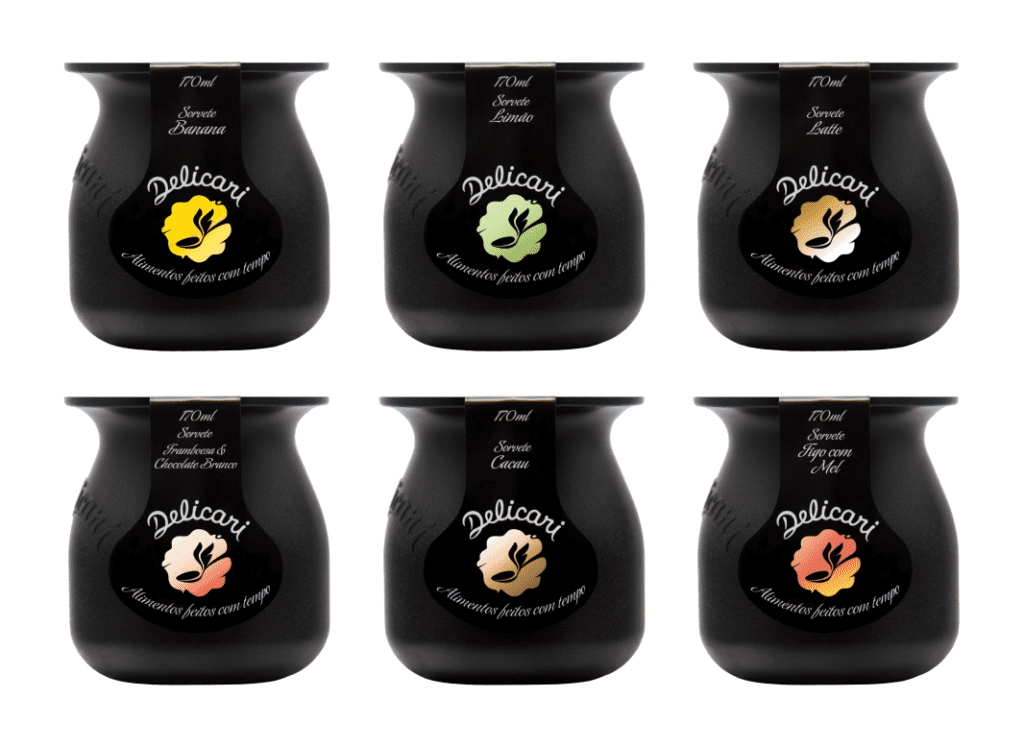
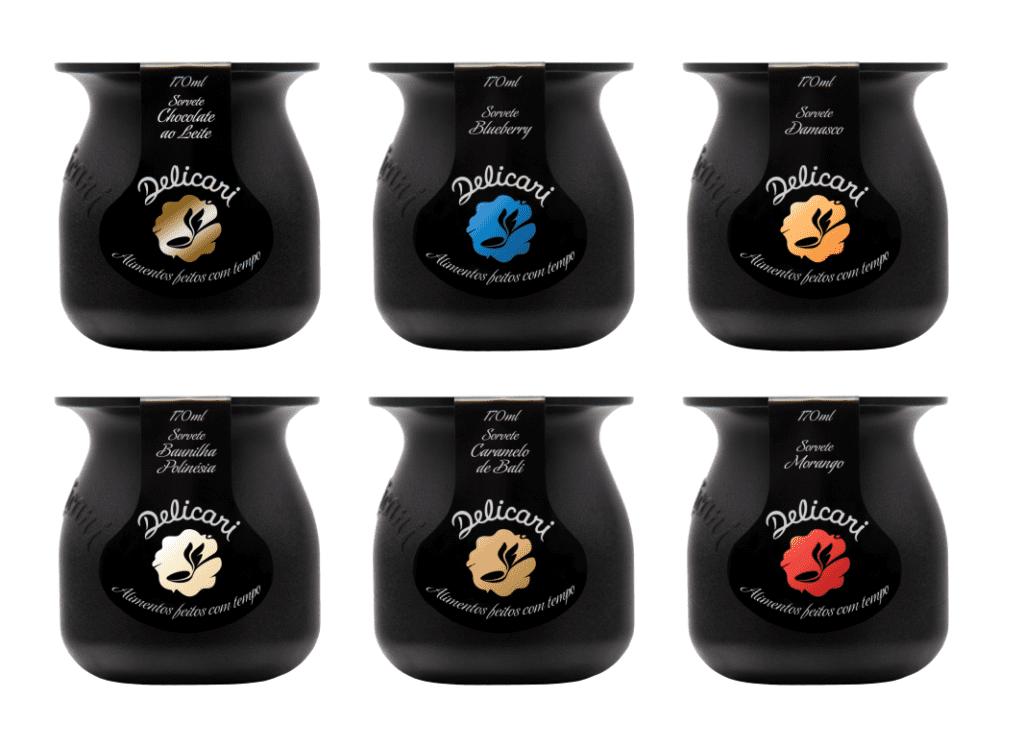
The container departs from category standards and establishes its own presence. The use of black breaks with the dominant aesthetic and shifts the product into a less predictable and more intentional territory.
Initially, the label was applied manually, with limited space. This constraint led to a direct visual language, with few elements and immediate readability.
Over time, this limitation became identity: less explanation, more recognition.
3. Innovative Packaging: Bold Contrast
Delicari’s packaging was not designed to blend into the category, but to stand out within it.
The exclusive 170 ml container creates an immediate visual and tactile contrast at the point of sale. This contrast happens before reading.
The choice of black reinforces this break. In a category dominated by light tones and predictable codes, the packaging shifts the product into a different frame.
The product stops competing only on attributes and starts competing for attention.
Registration as a Three-Dimensional Trademark
The shape of the container was registered and recognized as a three-dimensional trademark by the INPI (The Brazilian Trademark Office)
This means the container itself functions as a brand identifier, turning the design into a protected asset and making direct replication more difficult.
4. A Growing Portfolio, Unified by Design
Delicari expanded its portfolio while maintaining a central principle: visual consistency as a mechanism for recognition.
Today, the brand offers 13 yogurt flavors and 17 ice cream flavors, initially presented in the exclusive 170 ml container, which serves as the foundation of its identity.
As the company grew, new volumes were introduced (500 ml, 1.5 L, 3.5 L and 4.5 L), using standardized formats available in the market.
In these cases, differentiation does not lie in the container itself, but in how the brand is applied. The consistent use of black and the adaptation of labeling ensure clear identification of Delicari, regardless of format.
In practice, recognition does not depend on the packaging itself, but on the repetition of visual codes.
5. A Shared Commitment to Quality and Purity
From the beginning, Delicari and Leitíssimo have shared a commitment to high-quality, fully natural dairy products. Leitíssimo established this standard by producing milk from pasture-raised cows, free from artificial hormones and with a focus on animal welfare, providing a high-quality base for Delicari’s products.
With aligned values from the outset, their businesses evolved over time, and today Leitíssimo owns Delicari, further reinforcing their shared principles and commitments.
“Delicari – Food made with time. We let nature, at its own pace, create the flavors, aromas, colors, textures, and nutrients.”
Delicari is part of a movement toward a healthier, more natural, and more conscious relationship with food. By honoring nature’s rhythms, Delicari delivers dairy products that are pure, simple, and exceptional, shaping a distinctive presence in the dairy category.
Delicari Visual Identity and Packging
Phase 1

")

Ice Cream pots (170g)
Yogurt pots (170g)


Architecture: Gorios Neto

Mural: Sara Mello
")
")

