Oliq
Scope
Visual Identity
Design Principles
Proprietary Graphic Language
Packaging Graphic Design
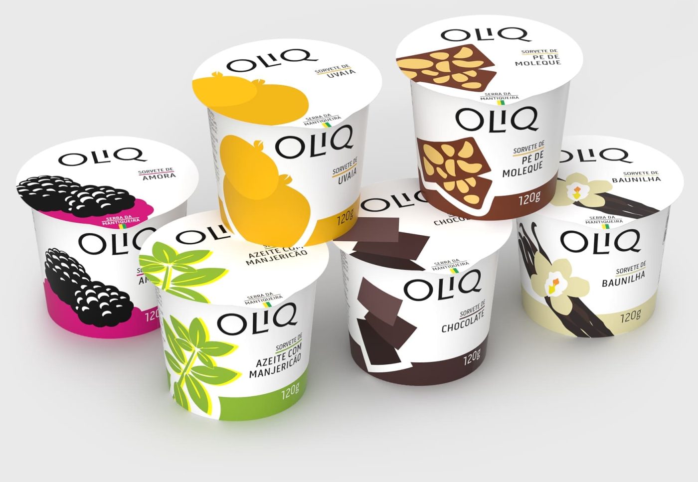
Design for Oliq’s Artisan Ice Cream Line
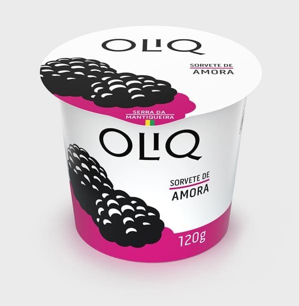
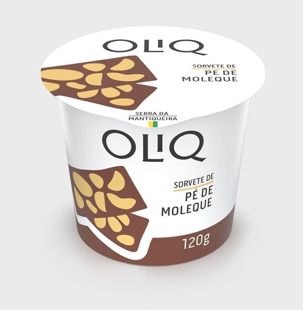
Oliq, founded in São Bento do Sapucaí [a small town in the Serra da Mantiqueira mountain range in Brazil, renowned for its natural landscapes and artisanal culture], where it produces extra virgin olive oils, fruit jams, dulce de leche, granola, tapenades, coffee, and other products, launched a line of premium ice creams. The packaging design challenge was to communicate, in a simple, modern, and effective way, the quality of these products from the Serra da Mantiqueira, developed by a brand deeply rooted in its territory. Having started with olive oil production, Oliq naturally expanded into products that celebrate local knowledge and traditions — and now, ice cream.
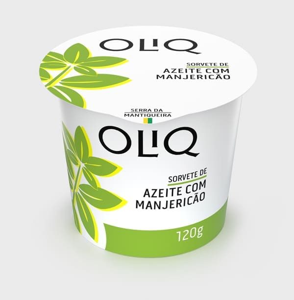
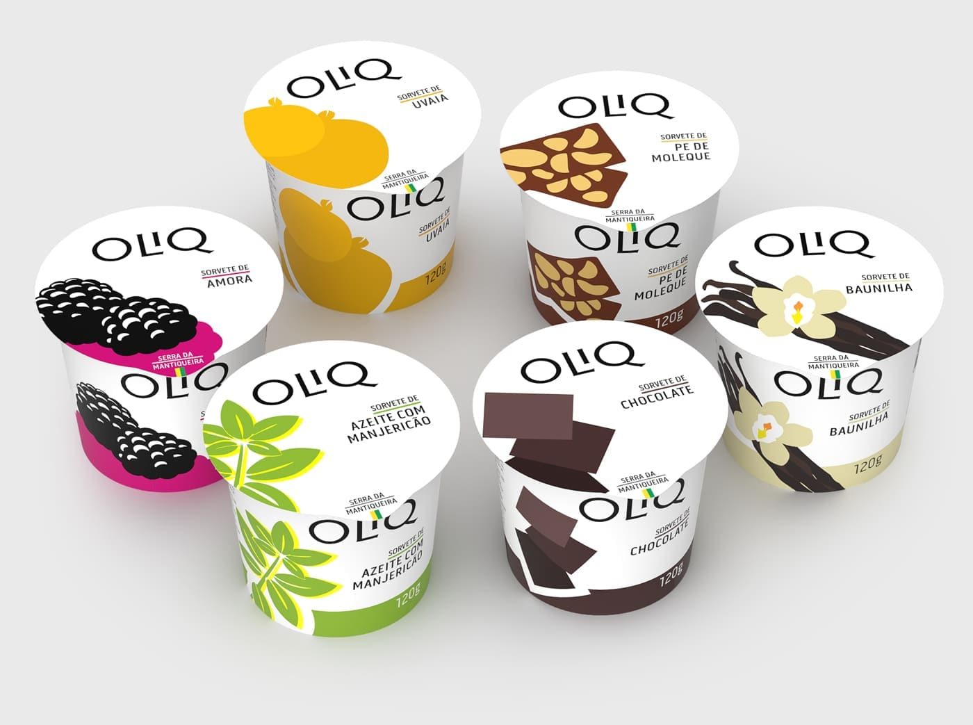
Some of the selected flavors — including olive oil with basil — reinforce this connection between the company’s original olive oil production and the creative exploration of the Mantiqueira terroir.
The Challenge
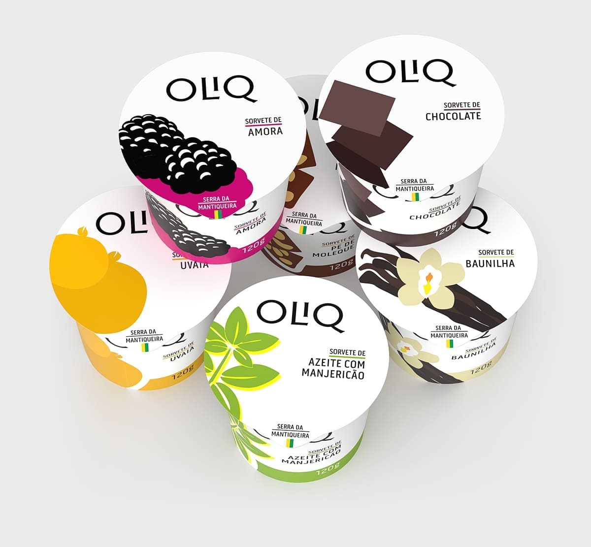
To create an identity system that balanced multiple demands: communicating the sophistication of an artisanal product, differentiating the distinct flavors, ensuring immediate recognition in point-of-sale freezers, and building a unique identity by establishing a proprietary system that provides protection against unfair competition (trade dress).
Solution: Layered Simplicity
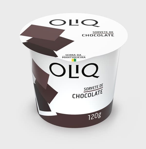
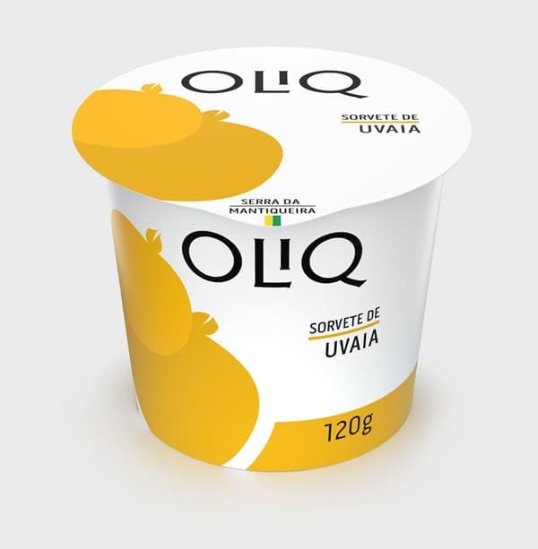
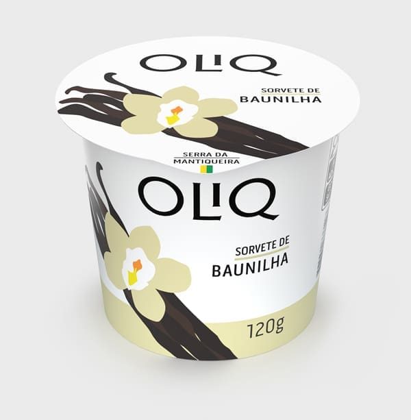
The project we developed expresses simplicity as its central philosophy. This pursuit of essence is not found in isolated elements, but in the precise orchestration of multiple layers of design:
- Minimalist representations of ingredients applied consistently
- A chromatic system with a dual-tone palette that establishes brand territory
- Calculated proportions and scales, with each illustration dimensioned to create a specific impact
- Strategic spatial composition, with element positioning that creates movement and hierarchy
- Intentional use of negative space, with white acting as an active design element
System as a Differentiator
The Outcome
A visual identity where the whole is greater than the sum of its parts. Each design decision integrates to create a system that is simultaneously simple and sophisticated, functional and distinctive.
Since 2016, Brandium has been developing design work for Oliq.
